Third Pillar
2020
Preparing a business consultancy company to go global through a web and logo redesign, thus refining and energizing their company in providing business transformation solutions to international companies.
01 /
CONTEXT
Logo Design
Web Design
Third Pillar is in the industry of guiding companies into the digital age. They assist companies in introducing effective and innovative solutions to be more efficient and advanced in their workflows, customer relations, and services. In partnership with IT companies, namely Salesforce, Vlocity, Syniti, Consus, and DocuSign, they help clients reduce costs, achieve more control of their operations, and accomplish key business goals.
Throughout their existence, they’ve catered to large local companies like Ayala, Globe, Cebu Pacific, and Petron by providing them with their business transformation solutions and technologies. Having success in the local landscape, they’ve now set their sights overseas. With plans to branch out from Philippine-based to international companies they needed a fresh new look and a digital platform that best represented their capabilities to an international market. Enter Qadra Studio.
02 /
IDEALS
A new look for a new direction
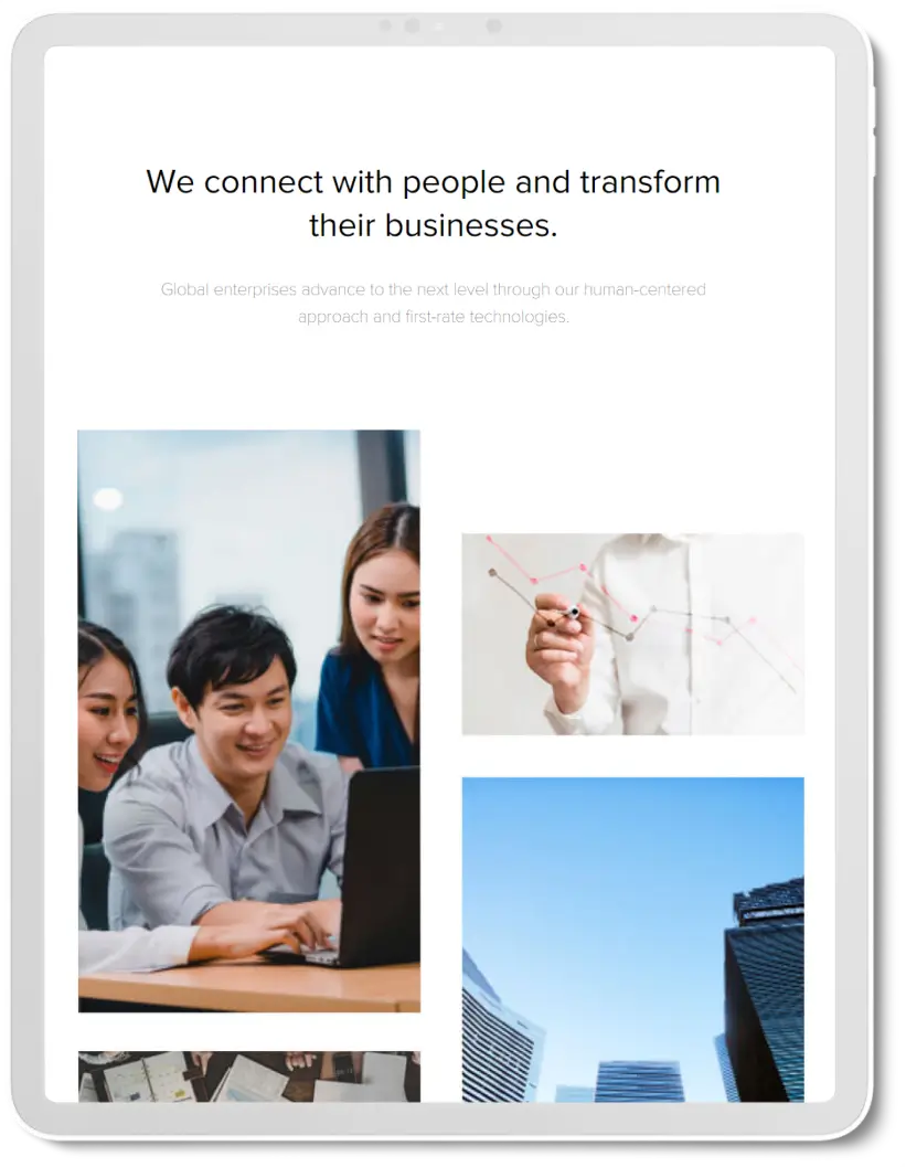
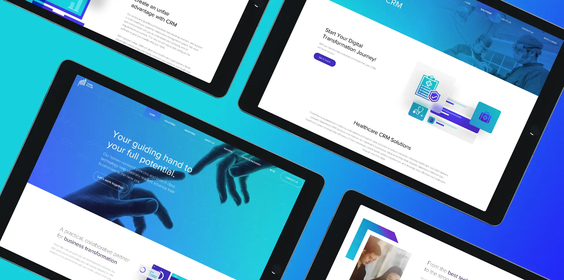
Third Pillar needed to redesign their website and realign its branding to revitalize their marketing efforts. The old website failed to convert visitors to new customers and truly reflect their brand. They wanted a friendly yet professional aesthetic that gave the impression that they were ahead of the curve, instead of an image that was cold, traditional, and dated. The new website must show that they’re not only about business but also about building strong relationships with their customers as they guide them through business transformation.
03 /
IDENTITY
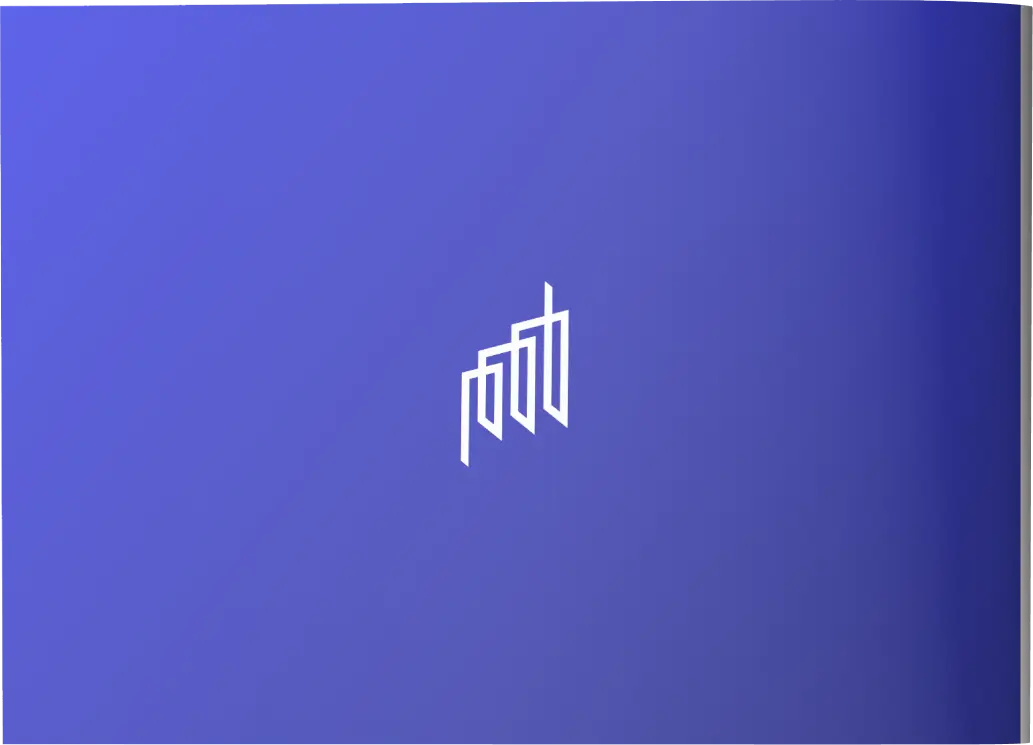
A modern take on an established icon
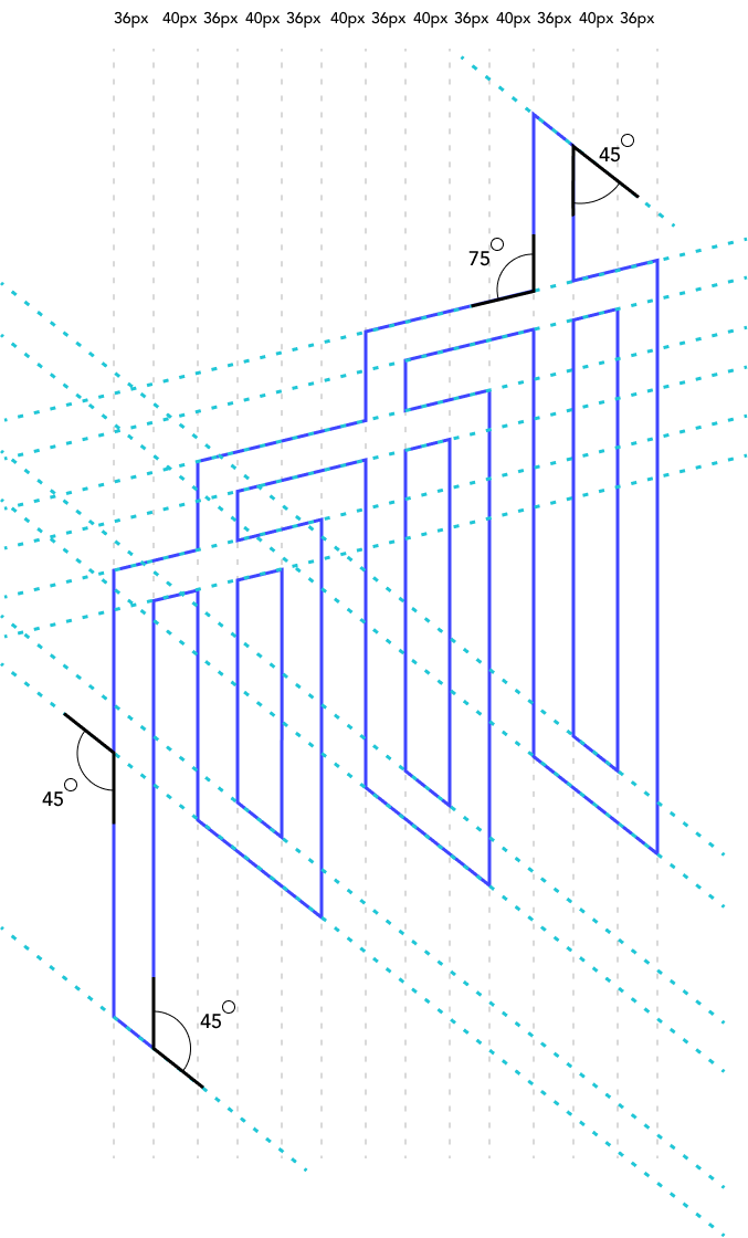
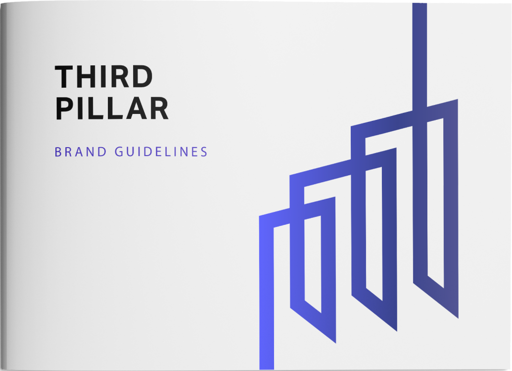
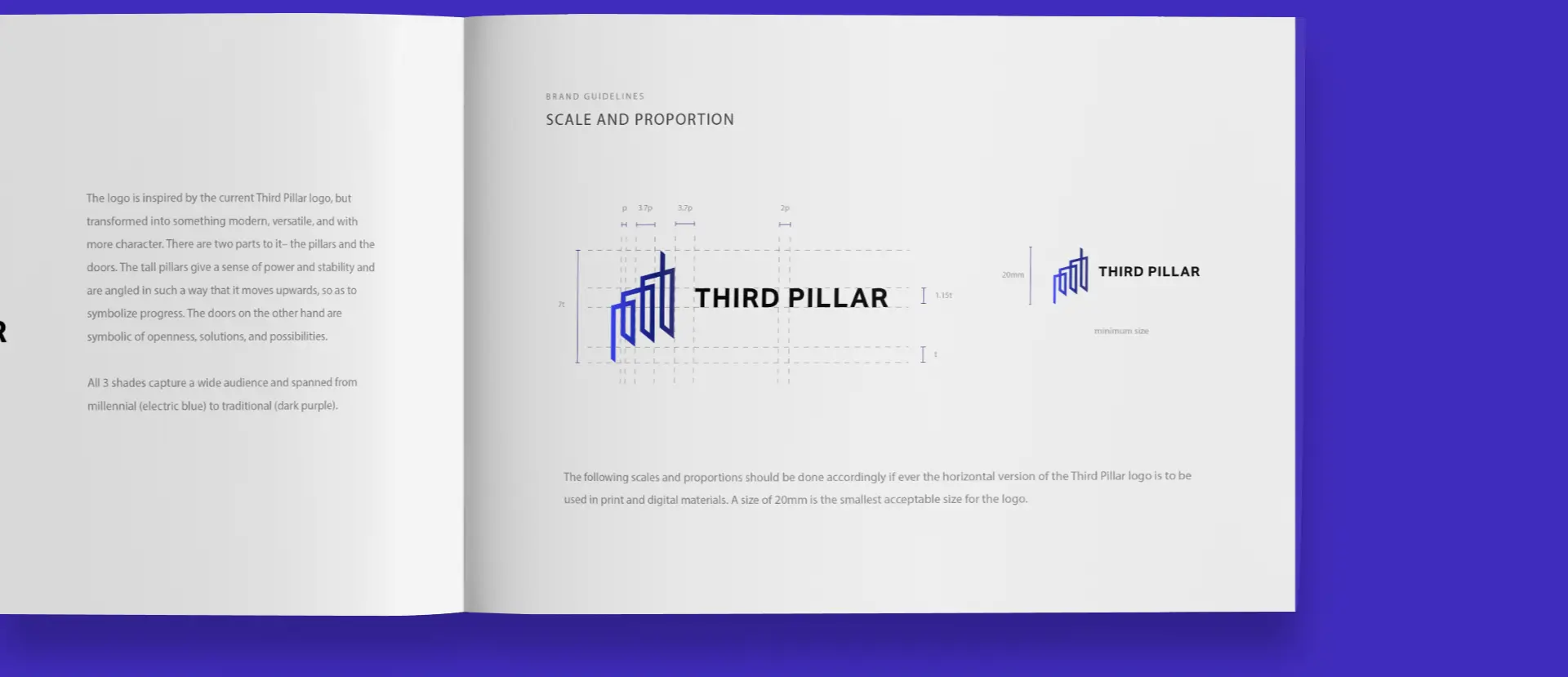
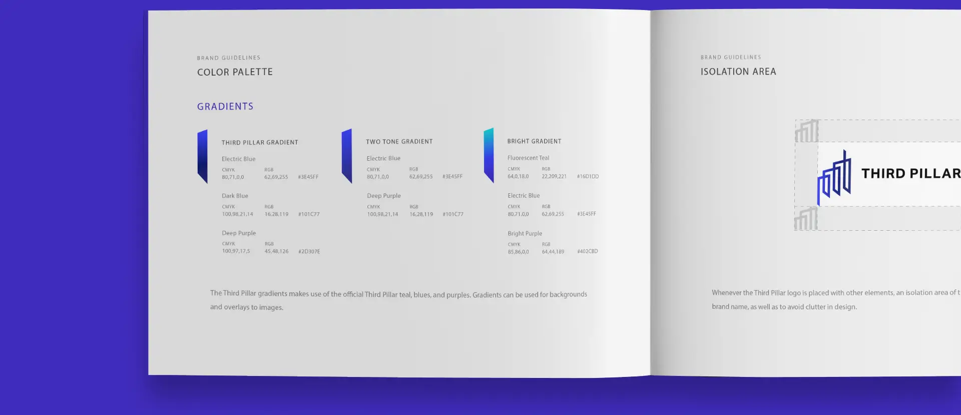
Taking cues from the old Third Pillar logo, we readied it for the future by giving it a modern and dynamic look that shows more character. The pillars in the design calls back to the idea of robustness, strength, and durability. Meanwhile, the doors symbolize openness, opportunities, and innovation not only for technologies but also for solutions. For the colors, we chose three shades that combine the contemporary and the traditional. Fusing the young electric blue and the regal dark purple, it casts a wide net for their audience.


04 /
VISUALS
Fresh solutions for a fresh start
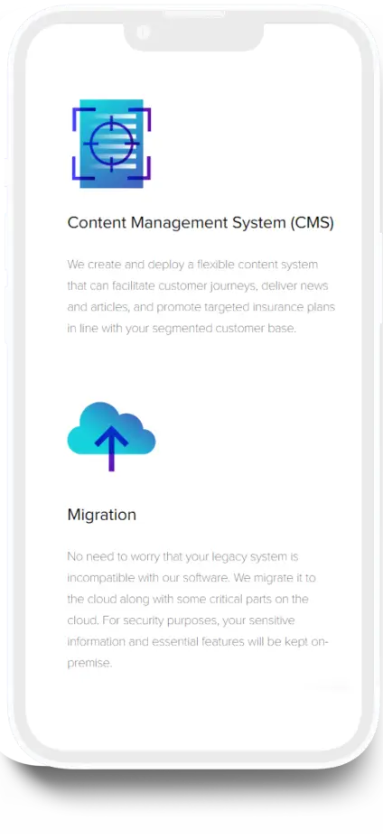
For the icons of each service, we created distinct looks that accurately represent the services they render. The style breathes contemporary youthfulness and tells visitors that the company follows the latest trends. On choosing the colors, we kept the color scheme from the logo to guarantee brand consistency.


05 /
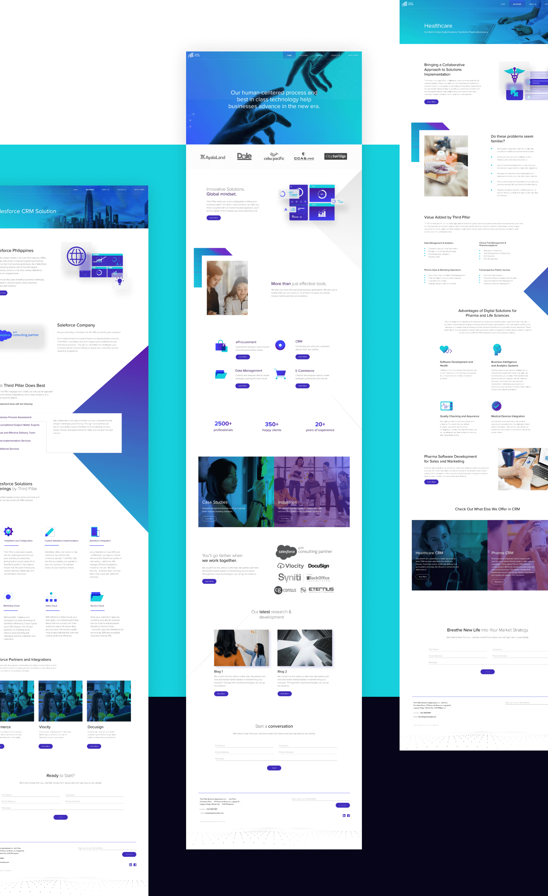
WEBSITE
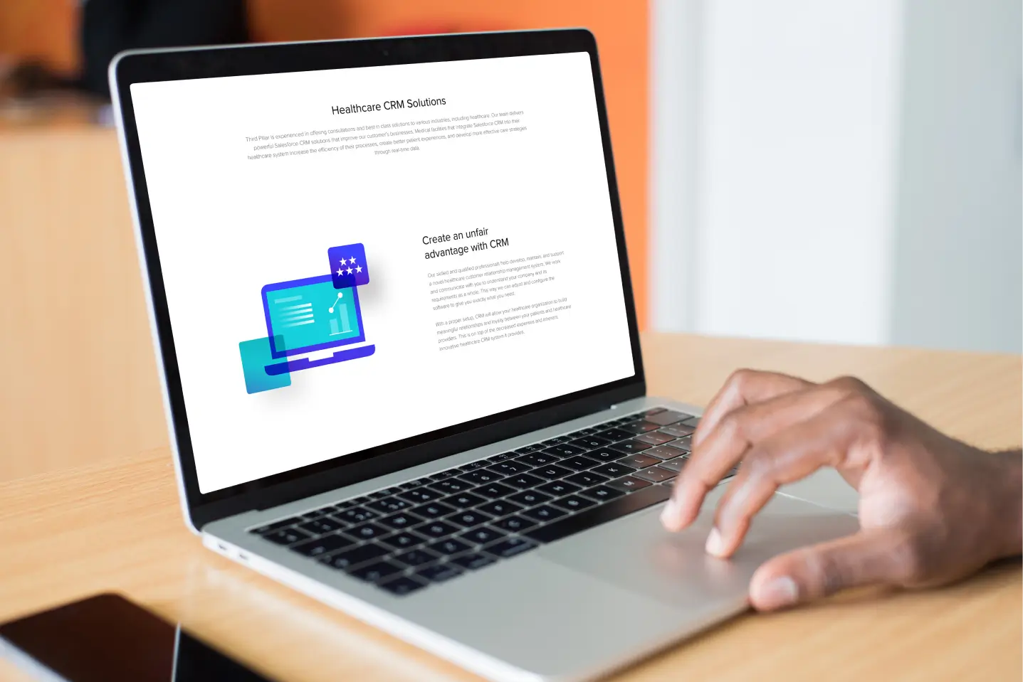
Showcasing their strongest marketing foundation
As a company website, the main goal is to market the business and inform customers about their company and solutions across the globe. We helped them achieve this by performing competitor and keyword research, developing site architecture, planning an actionable one-year content calendar, and creating an engaging and interesting web design. These ensure that they have user-friendly pages filled with profitable keywords and targeted content to gain inbound traffic and edge out their competition. In a matter of months, our efforts improved their daily search engine impressions by 700% and SEO traffic by 200%.