SERVICE
Creating an atmosphere of professionalism and trust for a customer-focused consultancy firm through a brand identity that’s timeless, straightforward, and a class-act in a service that puts the customer first.
HAND N HAND CONSULTANCY
2019


CONTEXT
Logo Design
The service industry is a wide and expansive one. But despite the wide variety in its threshold, one thing remains constant: the customer is king. No truer words have ever been spoken, especially for Hand N Hand. A consultancy firm based in Perth, Australia, Hand N Hand wanted to present themselves as a firm their clients can trust and rely on, despite being in the company of legions of other consultancy firms.
At the core of Hand N Hand is the genuine desire to help people find solutions. They wanted everything they did to evoke that sense of purpose, from the process all the way down to their identity. They needed a brand that was straightforward, no frills, that looked professional, refined and elegant, yet, most importantly, reliable and trustworthy. This is where we come in.
01/

Web Design
Web Development
Brand Guidelines
Brand Materials

02/
THE IDEALS
Always willing to lend a helping hand
Hand N Hand is all about being that guiding hand to their clients. Their name says it all, so it was important for us to create a brand that perfectly describes everything from who they are and what they are all about, to their mission and their vision from the moment their potential clients first lay eyes on their logo. We wanted a brand that showed a firm that need not shout to stand apart from its competitors. We wanted to create a visual language that was stripped down to its core principles while displaying a sense of authenticity and premium professionalism that, not only can the clients rely on, but also perfectly describes the women behind the brand.


03/
IDENTITY
Premium service, timeless design

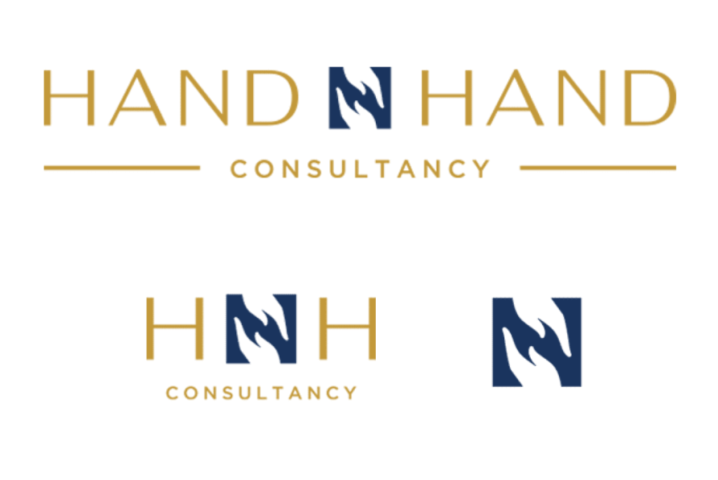
With clever use of negative space, the logo becomes a subtle nod to the brand’s resolve. The hands signify the warmth and friendliness that clients can expect from the firm, while the typeface balances that off with the promise of a service that is steadfast and dependable.
In choosing the color palette of the brand we went for a classic pairing of a dependable, intelligent navy blue with a premium touch of gold.
For the logo of Hand N Hand, we wanted their purpose to be at the forefront without being too in your face. We wanted a clean, crisp logo that had a premium and timeless quality to it. For this, we used an elegant yet simple typeface and paired it off with an icon that serves as the focal point of the brand’s logo. The ‘N’, found at the center of the brand’s namesake, is formed by two hands reaching out to each other, creating a standalone icon that describes what the brand is all about in one simple mark.


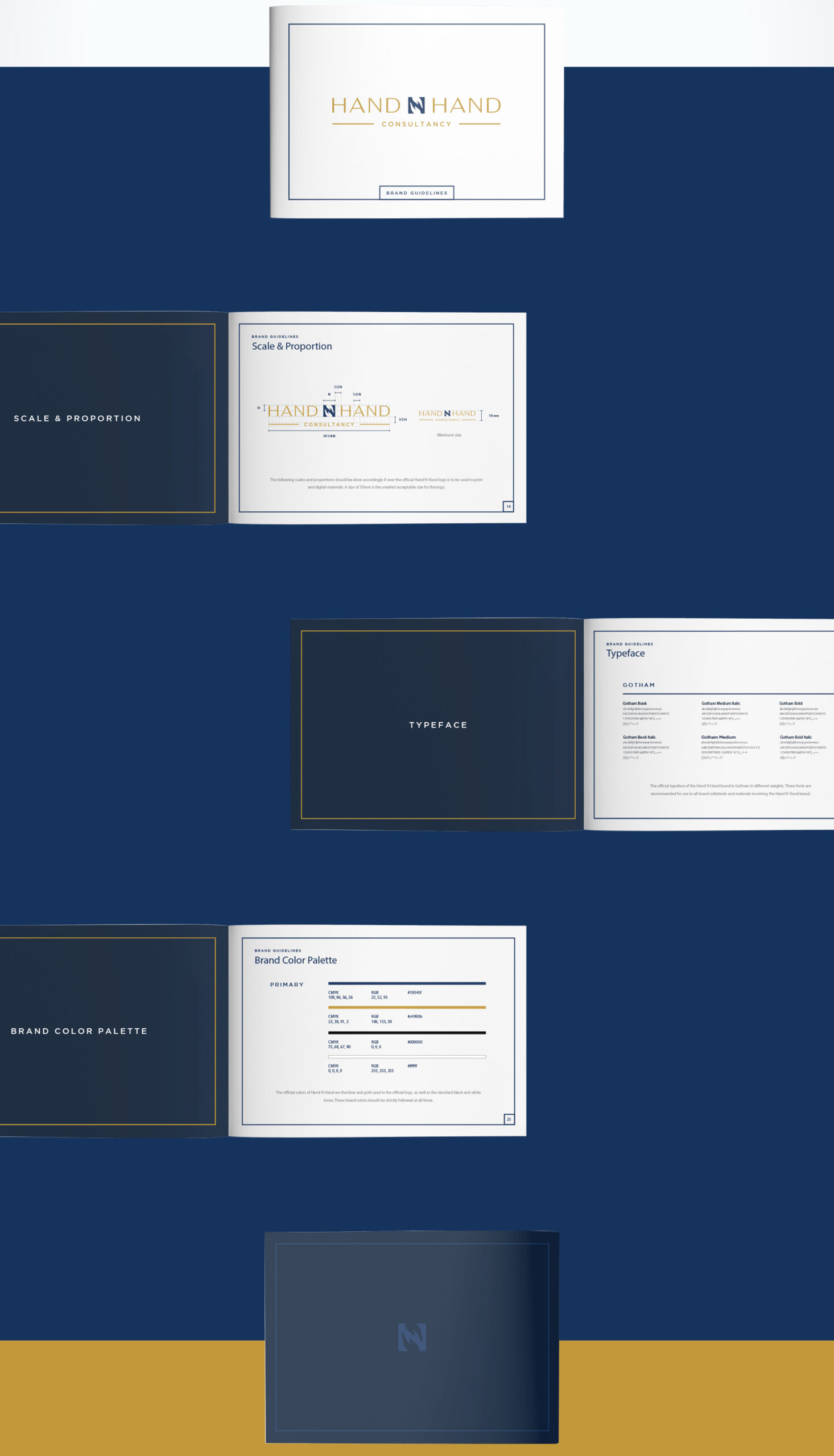
To accompany the logo, we created a brand bible that carefully illustrated the rules and guidelines of the brand so that its visual language remains consistent throughout all its materials and collaterals. The guideline in itself reflects that crisp premium quality that the logo evokes, from clean lines, classic italicized serif fonts, to crisp modern san serifs. The business card follows suit with a design that focuses on what truly matters.

IN THE WORLD WIDE WEB
With a touch of Australian congeniality
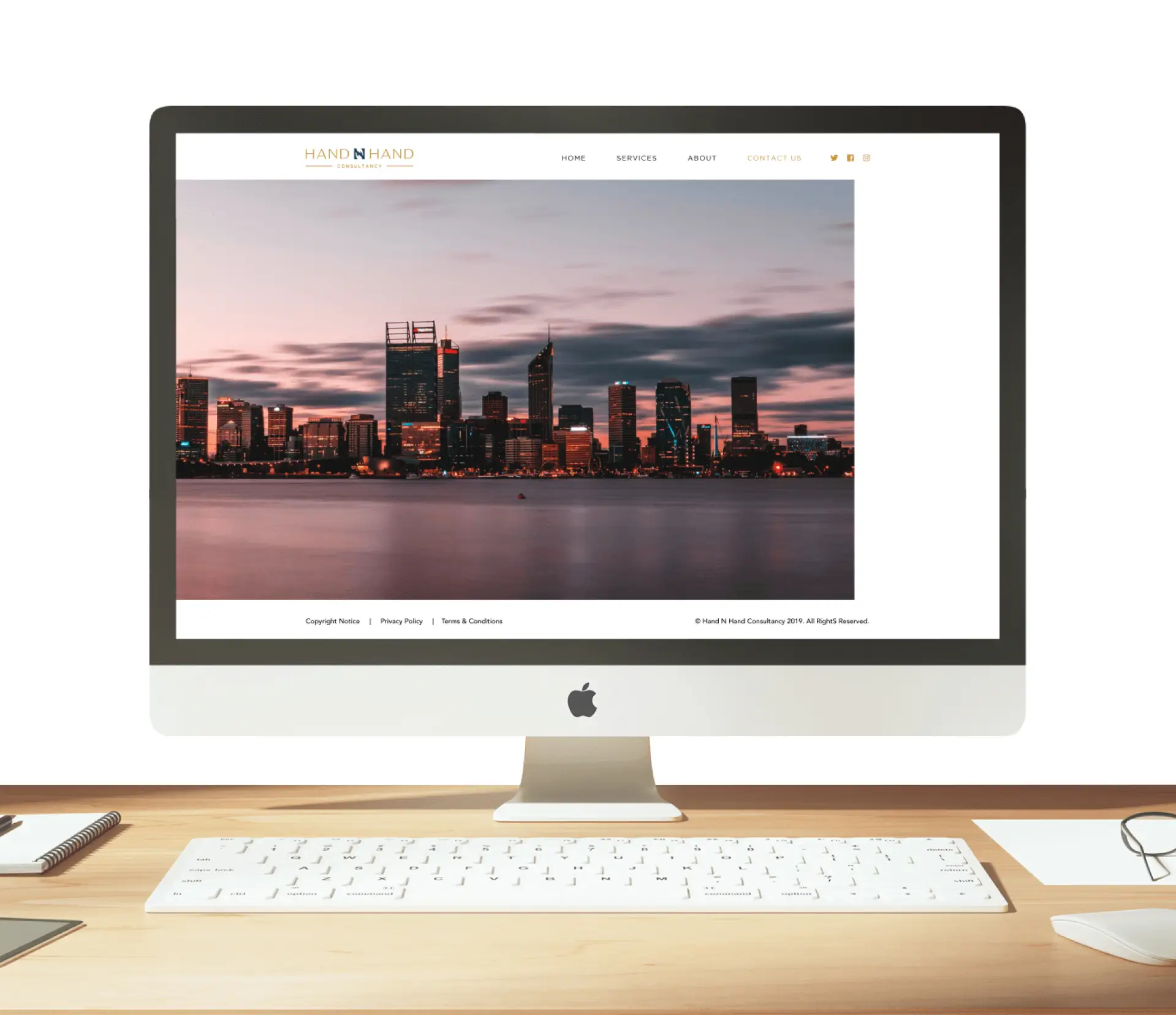
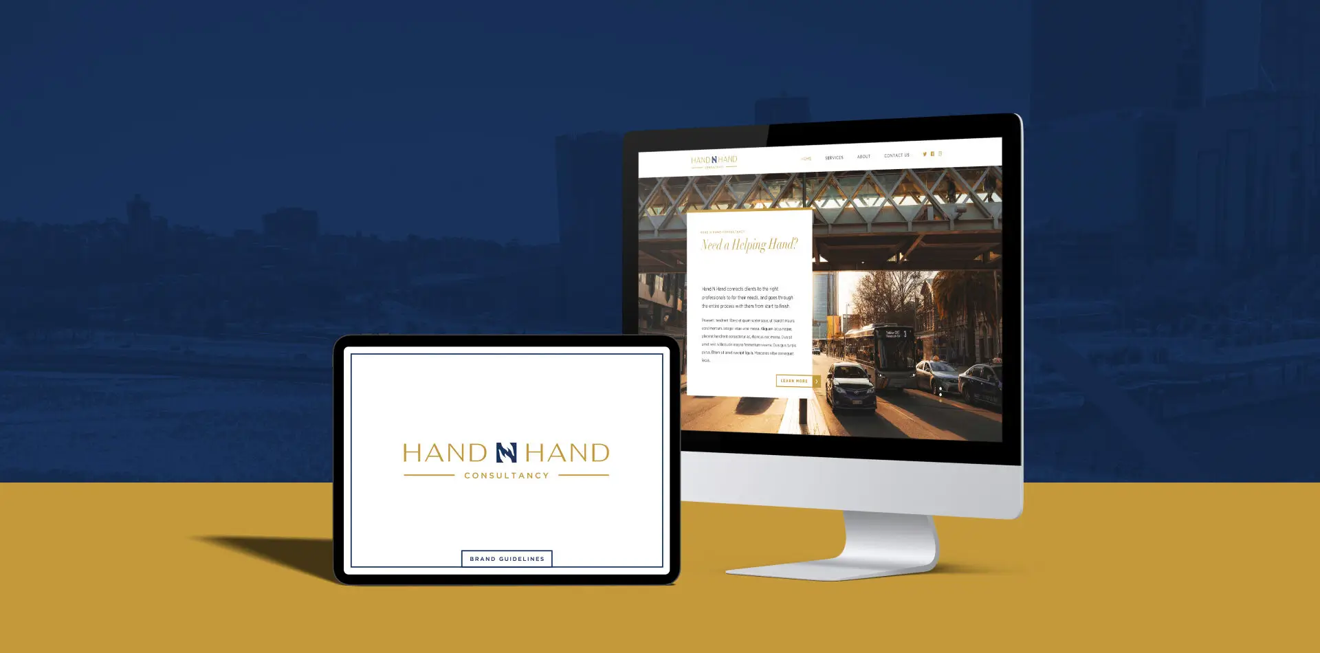
The website had to be a seamless extension of the firm’s identity. Apart from displaying all the necessary information to properly introduce them to their potential customers, they also wanted to include an undeniable part of the firm’s identity, the city it finds itself in: Perth, Australia.
The website is clean, classic, sophisticated and elegant, set against the backdrop of the stunning beaches, endless oceans, and warm cityscape of Perth, Australia. The design reminds the reader of their Australian heritage through glimpses of the city in each page. Through this, they indicate the professional and friendly way they carry themselves for clients, as well as their pride for their Australian brand of congeniality and expertise.
04/


SERVICE
HandnHanD
2019
Creating an atmosphere of professionalism and trust for a customer-focused consultancy firm through a brand identity that’s timeless, straightforward, and a class-act in a service that puts the customer first.

01/ Context
Logo Design
Brand Guidelines
Brand Materials
Web Design
Web Development
The service industry is a wide and expansive one. But despite the wide variety in its threshold, one thing remains constant: the customer is king. No truer words have ever been spoken, especially for Hand N Hand. A consultancy firm based in Perth, Australia, Hand N Hand wanted to present themselves as a firm their clients can trust and rely on, despite being in the company of legions of other consultancy firms.
At the core of Hand N Hand is the genuine desire to help people find solutions. They wanted everything they did to evoke that sense of purpose, from the process all the way down to their identity. They needed a brand that was straightforward, no frills, that looked professional, refined and elegant, yet, most importantly, reliable and trustworthy. This is where we come in.

02/ Ideals
Always willing to lend a helping hand
For the logo of Hand N Hand, we wanted their purpose to be at the forefront without being too in your face. We wanted a clean, crisp logo that had a premium and timeless quality to it. For this, we used an elegant yet simple typeface and paired it off with an icon that serves as the focal point of the brand’s logo. The ‘N’, found at the center of the brand’s namesake, is formed by two hands reaching out to each other, creating a standalone icon that describes what the brand is all about in one simple mark.
With clever use of negative space, the logo becomes a subtle nod to the brand’s resolve. The hands signify the warmth and friendliness that clients can expect from the firm, while the typeface balances that off with the promise of a service that is steadfast and dependable.
In choosing the color palette of the brand we went for a classic pairing of a dependable, intelligent navy blue with a premium touch of gold.

03/ Identity
Flash of warmth in the cold, corporate world
The website had to be a seamless extension of the firm’s identity. A part from displaying all the necessary information to properly introduce them to their potential customers, they also wanted to include an undeniable part of the firm’s identity, the city it finds itself in: Perth, Australia.
The logo is inspired by ancient Chinese armor akin to the ones worn by Lü Bu himself. The shield and bold lines symbolize strength while the eight diamonds encircle the name to signify wealth and fortune in Chinese culture. The colors, on the other hand, balance out the logo’s strength and power. For the brand colors, nothing suggests tranquility and sereneness like shades of blue and gold. Not only that but these colors also reflect a strong, steady current that epitomizes the brand.


In the packaging, we placed Lü Bu above a dragon in tempestuous waters that shows how, similar to Lubu Beer, what may appear relaxing on the surface can hide immense strength underneath. By using clean lines in displaying our subject among the hop plants and clouds, we were able to make the design simple and elegant while hiding significant details.
Lubu Beer has two packaging options, one in the classic beer bottle and another in a can. We carefully adjusted and altered our symbolic design to fit both. For the bottle version, we added a cool detail on its bottle cap to greets its drinkers with an icon of the hop plant surrounded by the same borders of the shield-like logo. Whichever the buyer picks up, we want them to have the same experience of how knocking back a cold Lubu Beer provides a sense of calm while understanding you’re in the presence of great history that conceals power within.

04/ Online Presence
All business but feel at home
The website had to be a seamless extension of the firm’s identity. Apart from displaying all the necessary information to properly introduce them to their potential customers, they also wanted to include an undeniable part of the firm’s identity, the city it finds itself in: Perth, Australia.
The website is clean, classic, sophisticated and elegant, set against the backdrop of the stunning beaches, endless oceans, and warm cityscape of Perth, Australia. The design reminds the reader of their Australian heritage through glimpses of the city in each page. Through this, they indicate the professional and friendly way they carry themselves for clients, as well as their pride for their Australian brand of congeniality and expertise.