Bliss & Bean
2019
Weaving a landscape of color and texture to create a playful backdrop for the symphony of flavors at work in the Bliss & Bean Chocolate.
01 /
CONTEXT
Logo Design
Creative Direction
Packaging Design
Today, the chocolate industry has been pushing the boundaries when it comes to packaging and design. Gone are the days of simple wrappings and logo-centric designs. From painterly marks and detailed illustrations to laser-cut designs and 3d embossed geometries, the landscape has become a vibrant melting pot in itself. The simple chocolate box isn’t just a box anymore. It’s a work of art.
Bliss & Bean understands that when it comes to food you eat with your eyes first, and chocolate is no exception. Bliss & Bean’s wants were simple: a playful design to match their playful chocolates, all while staying classic and luxurious. They wanted color and they wanted texture — two languages we happen to be fluent in. They had a clear vision for how they wanted the packaging to feel. Now the only thing we had to do was make them look as good as they feel.
02 /
IDEALS
A night at the jazz concert
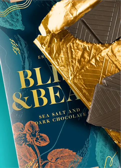
Eating chocolate is often an experience in itself. It can hit various taste buds at the same time while eliciting a spectrum of emotions. It can be smooth and sensual, yet brazen and unexpected. A vibrant symphony of unlikely pairs, from raw, playful, and textured to smooth, lush and velvety, what chocolate is to the culinary world, is what jazz is to music.
Keeping that in mind, we wanted to create a concert of all these different textures and colors to create a visual, almost sensual representation of the vibrant, cosmic experience one goes through while eating good chocolate. We wanted noise and grit, we wanted rhythmic snares, obnoxious trumpets, and carnal saxophones. We wanted layers and depth, subtleties and intricacies balanced out with pops of colors.
We wanted front row seats to the best jazz concert in town.
03 /
IDENTITY
A symphony
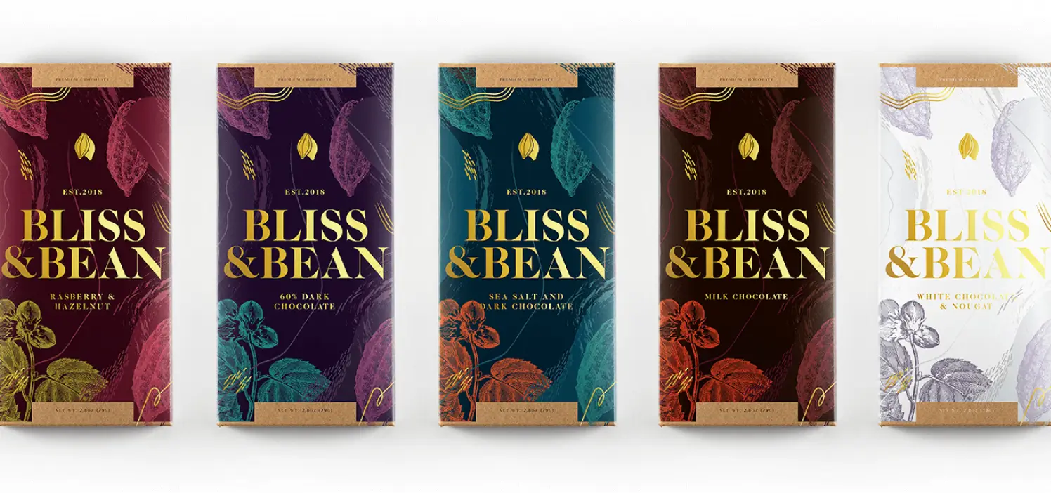
Bliss and Bean’s identity can be divided into two parts: its logo and its visual elements.
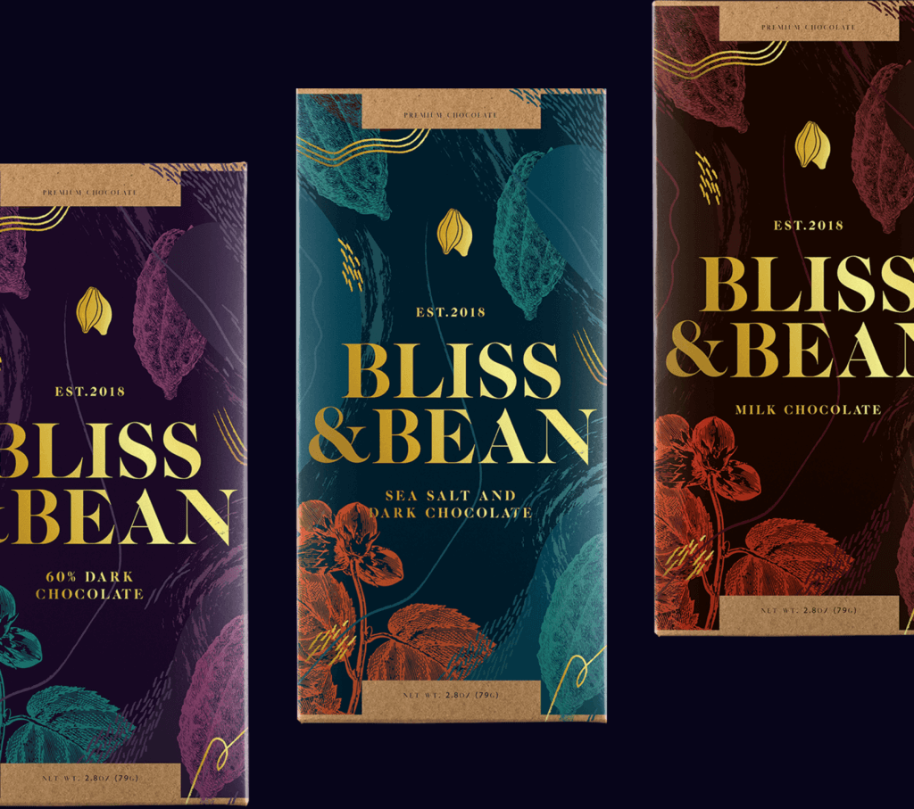
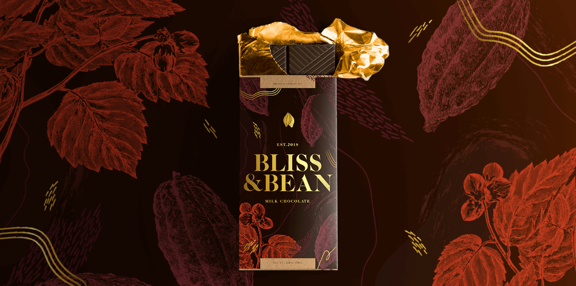
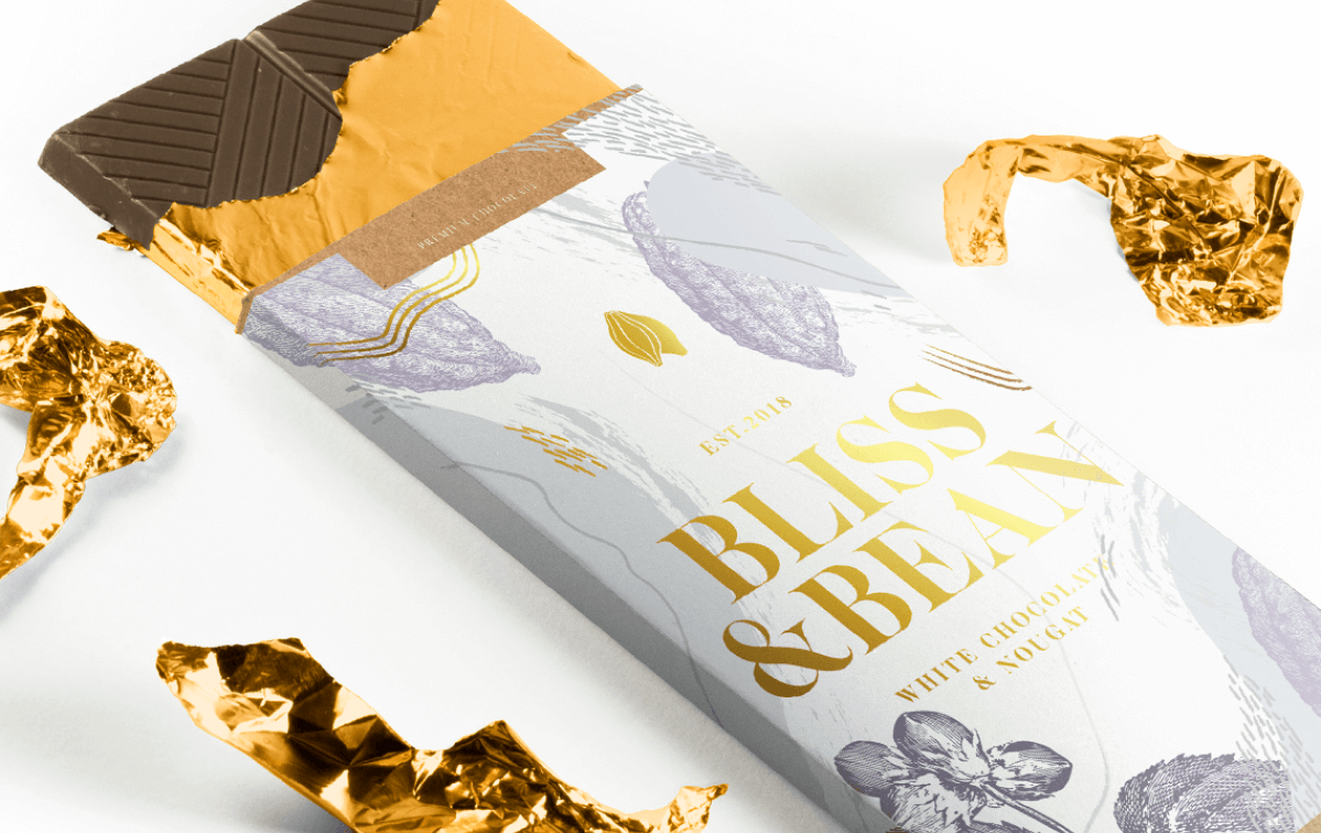
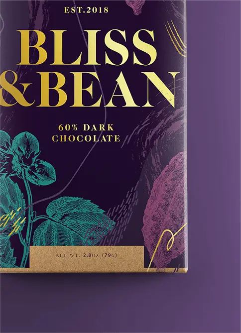
With such a lush landscape of textures as its background, the logo had to be bold enough to stand out. Aiming for balance, we wanted to keep things simple and classic yet striking and eye-catching. We decided on a bold serif that had all the right curves, is classic yet contemporary, sensual yet strong, and could hold its own in a crowd. To top it all off, we placed a simple illustration of hanging cacao beans to serve as a reminder that despite all the bells and whistles, the chocolate, the cacao is king.
Not to be outshined by the brand’s mark, Bliss & Bean’s identity is as much in its lines and makings as it is in its logo. From vintage illustrations of the cacao bean and its plant, to organic and playful markings and painterly strokes, Bliss & Bean is a melting pot of different sensory pulse points. It is an orchestra with many moving parts, all contributing to one singular image. Bliss & Bean is a classic example of how the whole is greater than the sum of its parts.


04 /
ANATOMY
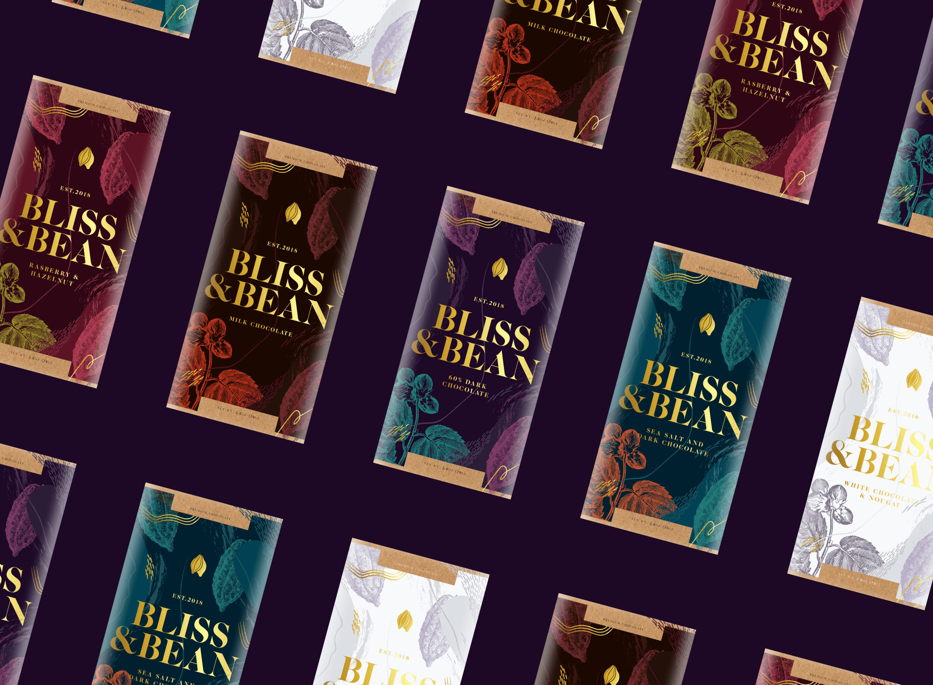
A playground of color and texture
The service industry is a wide and expansive one. But despite the wide variety in its threshold, one thing remains constant: the customer is king. No truer words have ever been spoken, especially for Hand N Hand. A consultancy firm based in Perth, Australia, Hand N Hand wanted to present themselves as a firm their clients can trust and rely on, despite being in the company of legions of other consultancy firms.
At the core of Hand N Hand is the genuine desire to help people find solutions. They wanted everything they did to evoke that sense of purpose, from the process all the way down to their identity. They needed a brand that was straightforward, no frills, that looked professional, refined and elegant, yet, most importantly, reliable and trustworthy. This is where we come in.