APOTC
2020
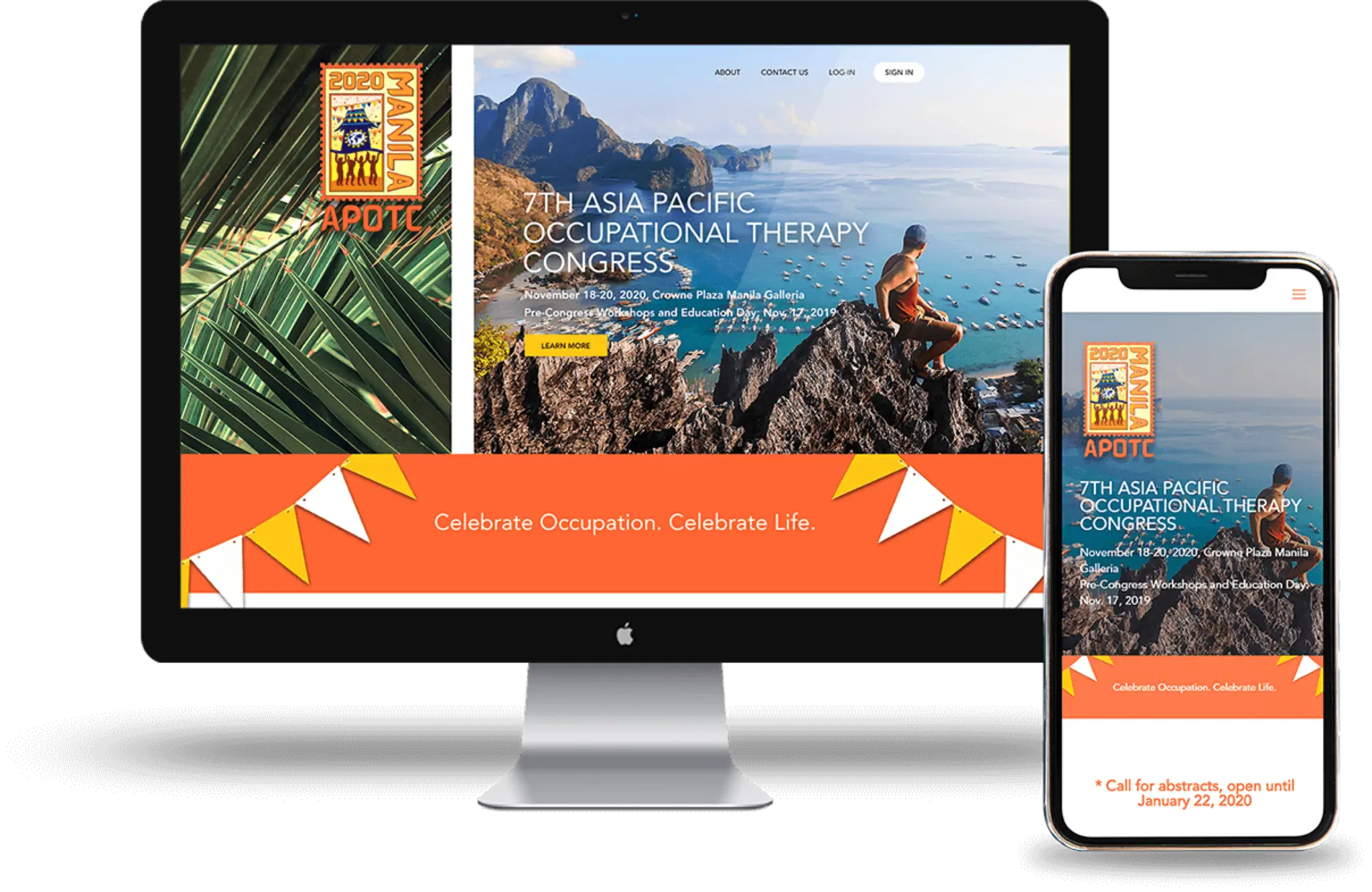
Creating a vibrant and colorful brochure website that is not only a one stop shop about the congress but also a virtual celebration of the Philippines.
01 /
CONTEXT
Website Design
Website Development
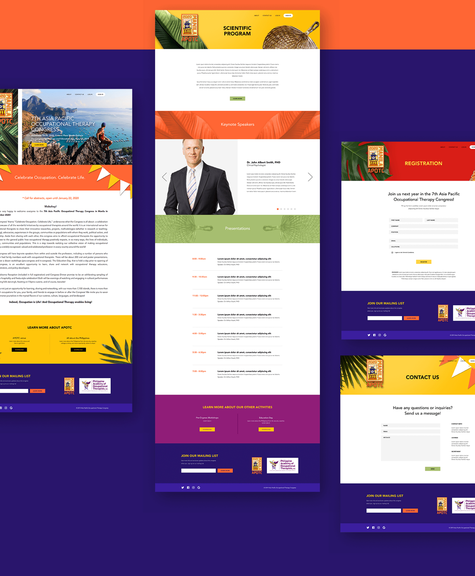
The Asia Pacific Occupational Therapy Congress (APOTC) is an annual gathering of occupational therapists around the globe to showcase and share everything from projects and initiatives, to researches and advocacies. From talks and presentations, to workshops and social gatherings, the congress is an opportunity to show the public the importance and positive impact that occupational therapy has on the world.
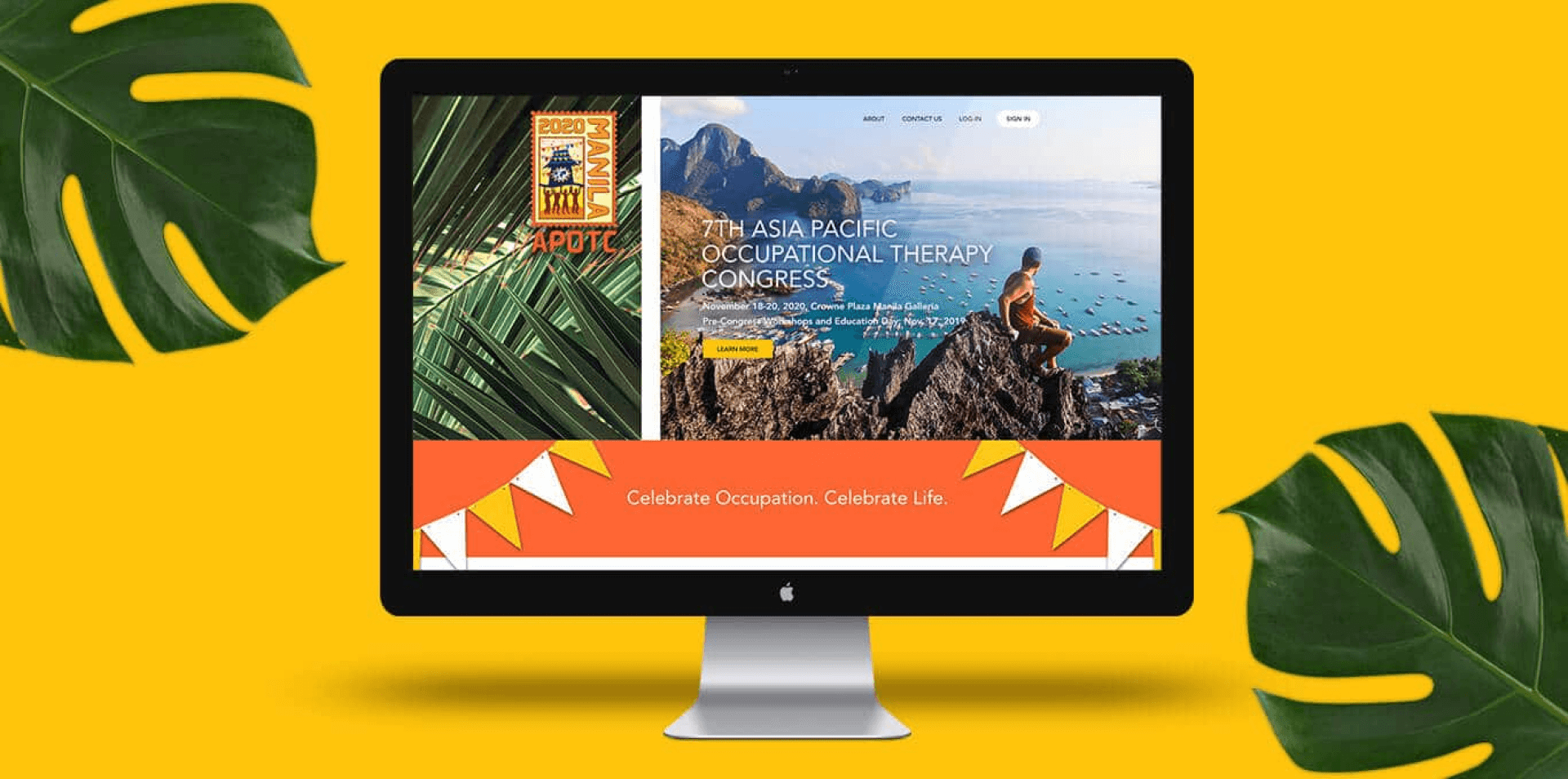
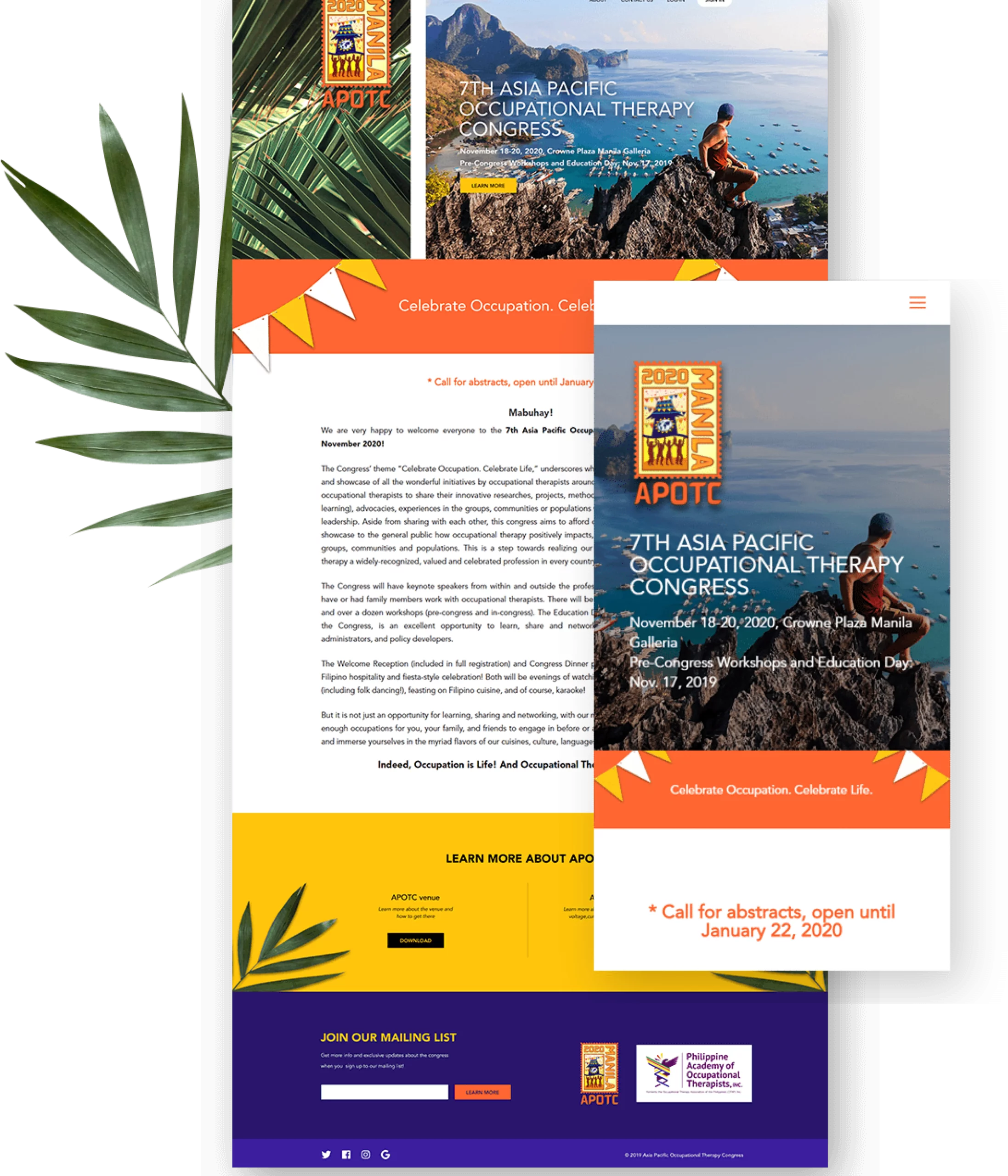
For the 7th APOTC, the client wanted a website that was not only in line with their theme for 2020, “Celebrate Occupation. Celebrate Life.” but also a celebration and showcase of the Philippines itself. They wanted something colorful, fun, and uniquely Filipino; all things that are right up our alley.
02 /
IDEALS
A celebration
If there was one take away from what the Asia Pacific Occupational Therapy Congress is, it is that its a celebration: a celebration of occupation, of therapy, a celebration of life, and a celebration of the Philippines. We wanted to emulate that on the website. Taking a cue from their logo, we wanted a vibrant, festive feel, teaming with Filipino pride, without taking away from the client’s request for it to be clean, simple, easy to understand, and easy to navigate.


03 /
ELEMENTS
Uniquely Filipino
Throughout the website we wanted an unmistakably Filipino vibe. From the moment you enter the site, one is greeted with idyllic local landscapes and lush greenery; a postcard to the Philippines. Keeping in mind that the website had to be clean, almost minimalist, we opted to show Filipino festivity through the use of bright and punchy colors peppered with all things Filipino. With lines of bandaritas strewn across banners, abaniko fans bordering headers, and an assortment of tropical leaves and fruits adorning the page, the website is an unapologetic commemoration of the Philippines.
04 /
COLORS
Festival of colors
The colors take center stage in this design. It imbibes the right amount of festivity without going beyond the limitations of minimalism. With the APOTC logo as our inspiration, we chose colors that showed both life and warmth, two things that perfectly describes the nature of Filipinos. Bright oranges, sunset yellows, passionate reds, playful violets, and relaxing greens give life to the website, while deep purples give a lively contrast and a solid foundation for such playful colors.