Lubu Beer
2019
Fusing traditional Chinese art with a hint of modern design and a tranquil twist for a craft beer inspired by the ancient Chinese God of War, Lü Bu.
01
CONTEXT
Design
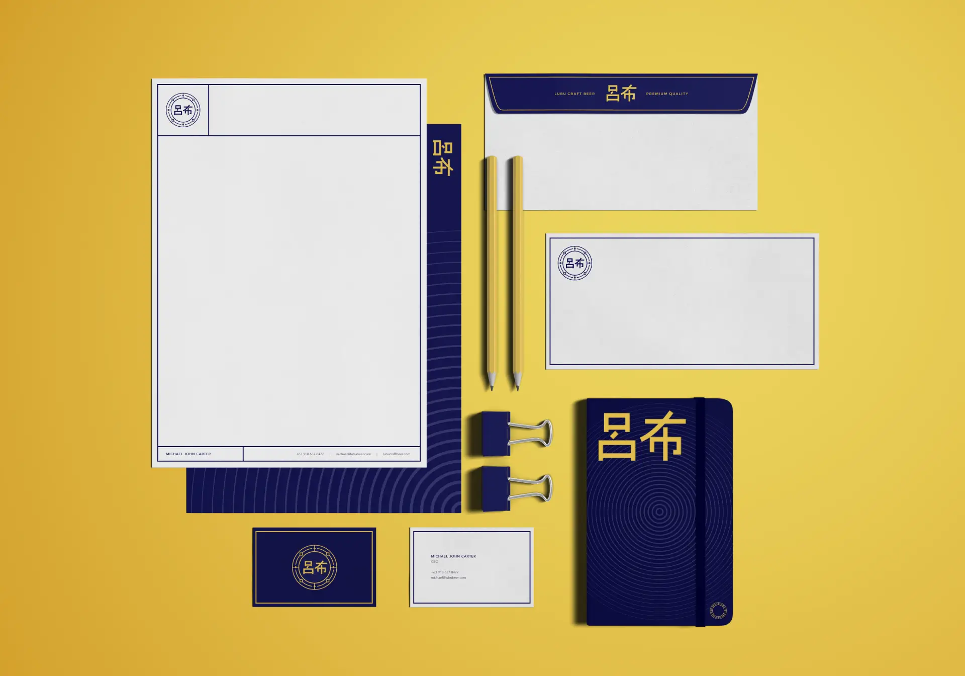
Branding
Packaging Design
Lü Bu was a military general and warlord who lived during the late Eastern Han dynasty of Imperial China. He was known to be a strong warrior, as well as a masterful archer and an excellent horse-rider. On the battlefield he was a fearsome sight to behold, laying death and doom on whoever challenged him.
When faced with the word’s warlord, fear, and death, there is usually a distinct image that comes to mind. From fire, blood, and gore, to dark, desolate sadness, you name it. So, it was interesting to hear that Lubu Craft beer was thinking of a slightly different take. They wanted a look that had a more serene feel to it. As opposed to images of death and destruction that war often evoked, they instead wanted to depict that feeling of looking back into the pages of history — a distant yet brewing feeling of the chaos that ensued. So, one tranquilized warlord, you ask? Challenge accepted!
02
IDEALS
Winding back the clock
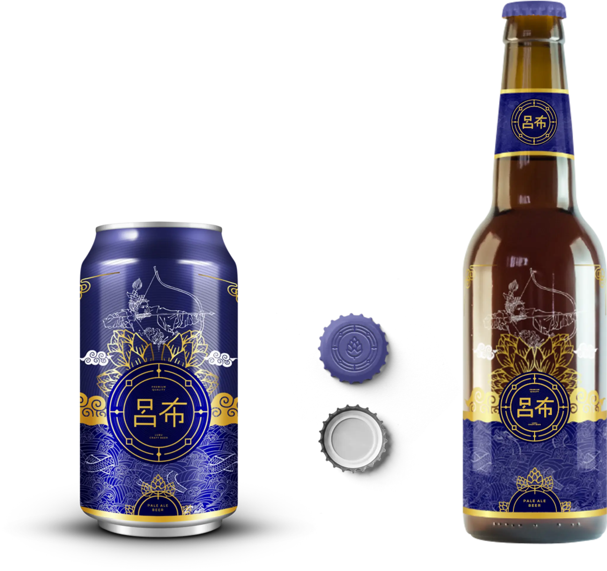
With the packaging of Lubu beer, we wanted it to look like it was part of an ancient Chinese scroll. That whoever drinking it would feel as if they’re taking a sip of history. To do that, we knew that traditional Chinese art had to be the star of the show. Using raw yet delicate illustrations, and keeping in mind the challenge of fusing the duality inherent in the brand, we incorporated Lü Bu, fully armored and ready to strike, set on top of a bed of hop plants and tranquil clouds. Beneath the clouds, we created an intricate pattern of a dragon weaving through turbulent waters. This, once again, depicts that duality and that sense of flow and strength.


03
IDENTITY
Show of strength through calm and serenity
The packaging and logo are designed to marry two different and contrasting ideas, bringing traditional Chinese art to the modern age, as well as fusing both power and tranquility. Soft curves are utilized throughout the design to denote peaceful currents while bold, graphic lines are a symbol of strength. But other than strength, the clean, crisp lines seen throughout the brand gives history a youthful update.
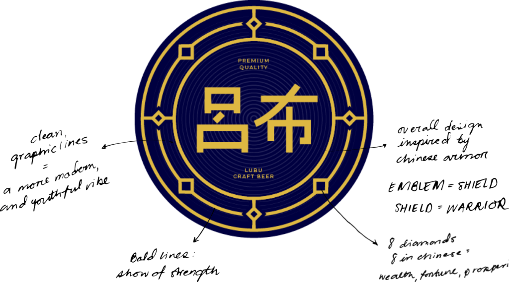
The logo is inspired by ancient Chinese armor akin to the ones worn by Lü Bu himself. The shield and bold lines symbolize strength while the eight diamonds encircle the name to signify wealth and fortune in Chinese culture. The colors, on the other hand, balance out the logo’s strength and power. For the brand colors, nothing suggests tranquility and sereneness like shades of blue and gold. Not only that but these colors also reflect a strong, steady current that epitomizes the brand.
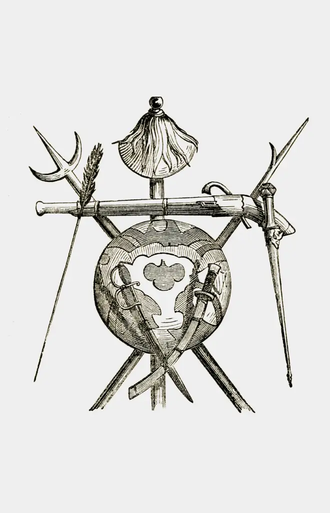
"Chinese and Tartar Arms": an illustration of 19th-century small arms used in the Qing Empire. 1851
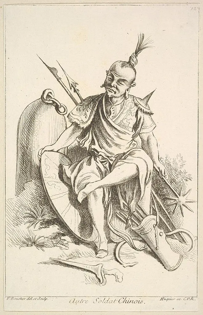
Chinese Soldier, 1738-45

Lü Bu
+

Ancient Chinese Shield
04
ANATOMY
Interweaving traditional and modern designs
In the packaging, we placed Lü Bu above a dragon in tempestuous waters that shows how, similar to Lubu Beer, what may appear relaxing on the surface can hide immense strength underneath. By using clean lines in displaying our subject among the hop plants and clouds, we were able to make the design simple and elegant while hiding significant details.
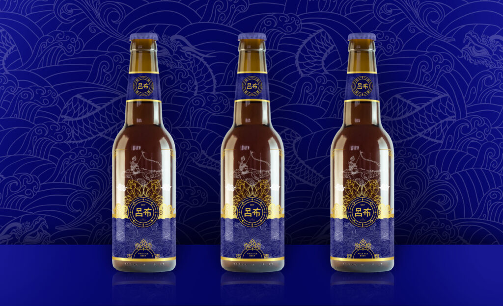
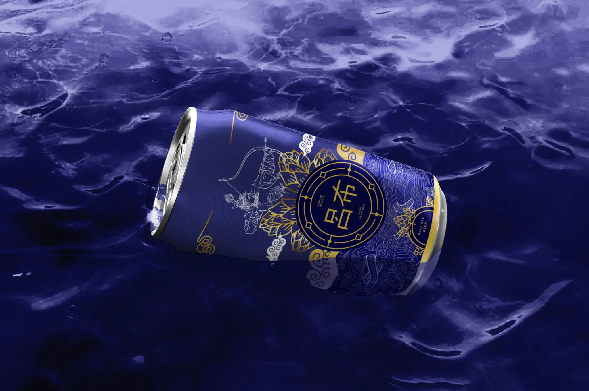
Lubu Beer has two packaging options, one in the classic beer bottle and another in a can. We carefully adjusted and altered our symbolic design to fit both. For the bottle version, we added a cool detail on its bottle cap to greets its drinkers with an icon of the hop plant surrounded by the same borders of the shield-like logo. Whichever the buyer picks up, we want them to have the same experience of how knocking back a cold Lubu Beer provides a sense of calm while understanding you’re in the presence of great history that conceals power within.